
A site thatreturns morethan it costs
We do the arithmetic first: how many people in your town look for what you do each month, and how many of them end up going to somebody else. That gap is what the page has to win back. You get the link to it together with the offer, not after it.
Most studios wait to be found.We work out who profits, then come to them.
We read your market the way your customer reads it: what they search for, what comes up first, who they end up calling. That shows how much work walks past you every month, and how much of it a site would bring back. When the arithmetic works, we build the page and send you the link, so the thing you judge is the page itself and not a promise about one. When it does not, we leave you alone.
One workshop, two pages
Same trade, same town, same hands: the facts are identical. All that differs is the decisions — what comes first, what was cut, and where the single button goes.
trucking across the city and the whole metro area
Affordable haulage across the city and the region
Since 2002 we have been moving freight across the city, the region and the towns of central Russia. We work on the principle of maximum transparency: the customer knows the price in advance, and the plate number of the truck as well.
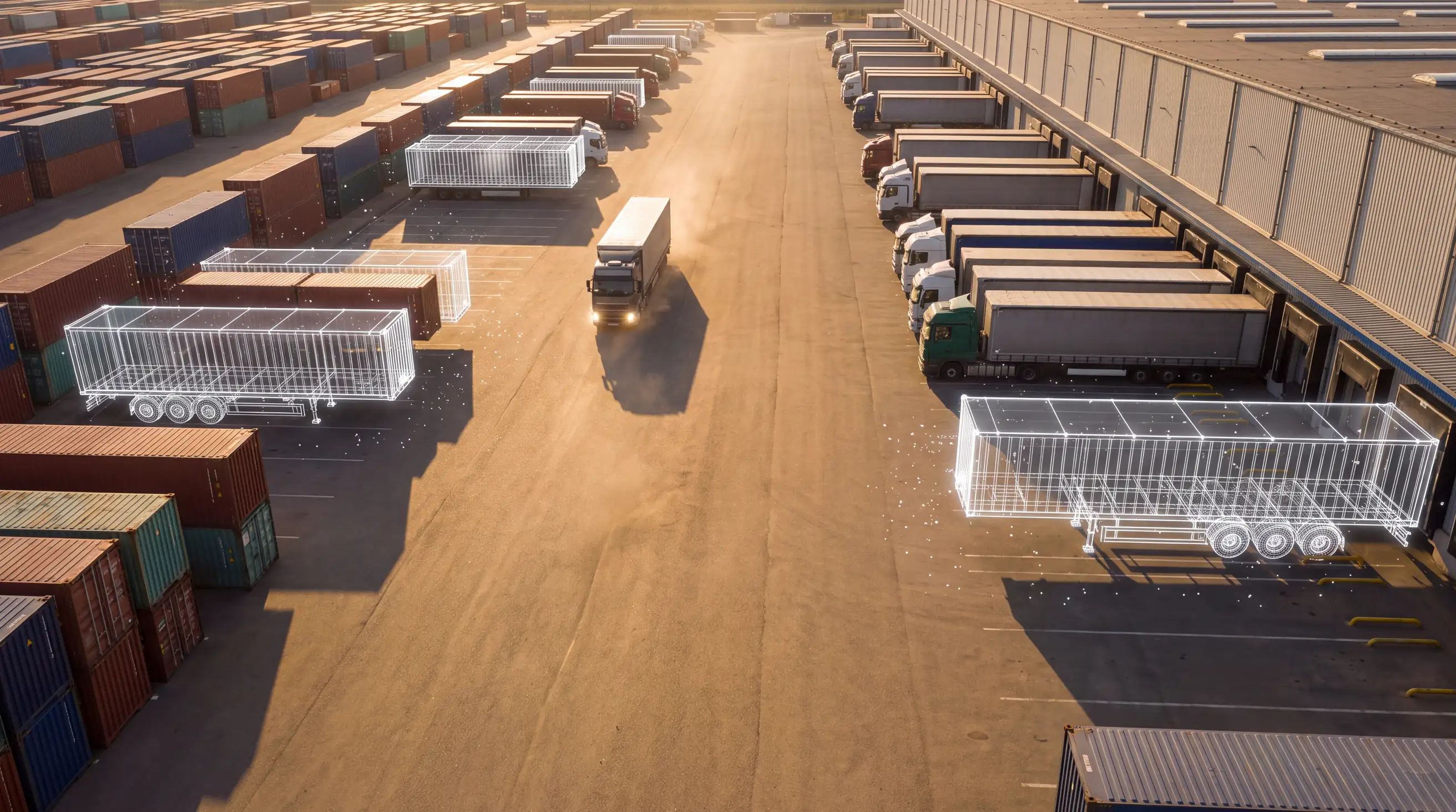
A truck at your gate in 90 minutes
The price is worked out before you order: rate, distance and loaders on one line.
Drag the divider
Above — the usual. Below — how we build.
A teaching pair, not a client case. Both halves are built here and drawn by your browser right now, because putting a picture of the difference on a web studio’s site is the same as describing it in words. The right half is deliberately NOT in this site’s own colours and type — a client’s site is built in the client’s language, not the studio’s.
The left half is drawn from a live haulier’s site that sits first for «грузоперевозки Москва» — one of the largest commercial queries in Russian. The name and the numbers are changed: our argument is with the genre, not with the company. And one correction to the word «first»: the link carried a yclid parameter, which is the click identifier Yandex Direct adds to its ads. The place was paid for. Traffic is being bought into that page.
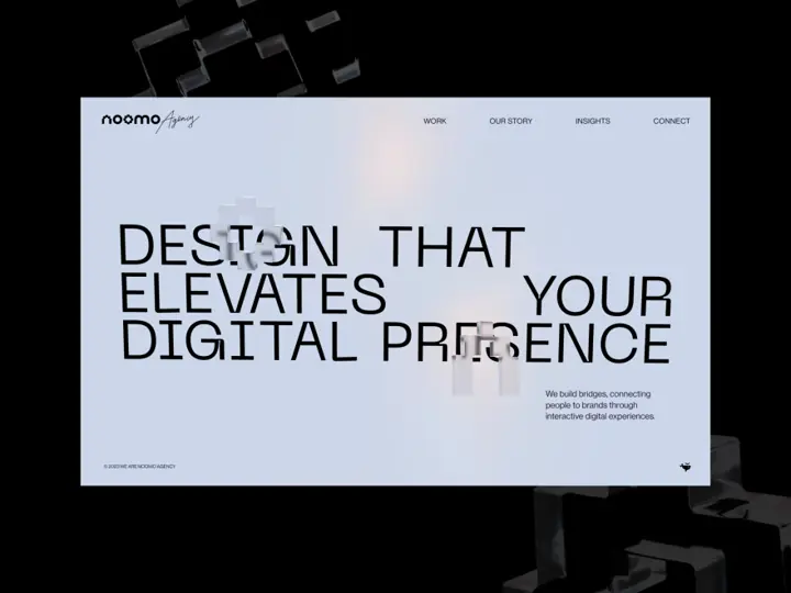
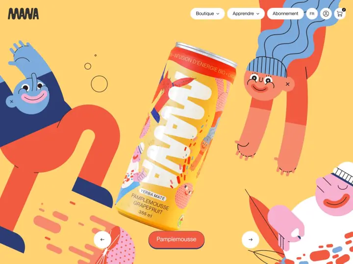

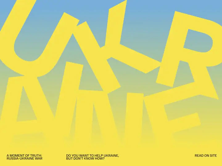
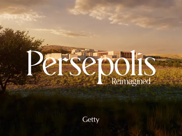


What we build
Four shapes. The fourth is the one usually faked with machine translation.
First site
A complete site for someone who has never had one: what you do, proof, prices where they help, and one clear way to reach you.
Replacement
A site exists and does nothing. We keep the facts, throw away the layout, and rebuild around the one action the visitor is there to take.
Single page
One product, one service, one campaign. Built to be linked from a message, a card, or a call, and to load on a phone on the move.
Two languages
The same site in Russian and English, split by path rather than by guesswork about where the visitor is sitting. Both halves are written, not translated.
Rates and timing
Three builds with a named price and a named number of days. The price is the whole price: hosting setup, the domain in your name and the source files are already in it.
Single page, 3D design
One page carrying dimensional graphics — the screen does the work a catalogue used to do.
Site of up to three tabs
Three tabs at most, and an hour of talking through your changes and making them is inside the price.
Multi-page site
A design system built to scale and a brand design with it, so the next page is assembled by the rules instead of from scratch.
Anything outside these three is a separate price list and is agreed before the work starts, never after. Prices are in roubles and we do not convert them: an invented rate is not a price.
How we know a site will pay for itself
Not a promise: an order of operations. Every step has a source we can name and a result you can check. If it fails at any step, we stop there and you never hear from us.
- R-01
Who is trading
WHAT WE READPublic government registries: who is registered in your trade, since when, and under which classification.
WHAT WE GETA list of businesses working right now, not ones that were listed once.
- R-02
How many are asking
WHAT WE READHow many people a month search for what you do in your town. Russia through Wordstat, the United States through a paid search-volume source.
WHAT WE GETA count of searches per month. Not “strong demand” — a number.
- R-03
Who takes them
WHAT WE READThe first page of results and the map listings for those searches: who ranks above you, and on what.
WHAT WE GETThe names the demand goes to today.
- R-04
What walks past
WHAT WE READThe gap between what is searched for and what reaches you: people who look and find nobody suitable.
WHAT WE GETThe size of the work nobody wins each month.
- R-05
Whether it is worth it
WHAT WE READThat gap set against the cost of the page and your average job value.
WHAT WE GETOne of two answers: build and write — or do not write at all.
The first four steps run without you and cost you nothing. You hear from us on the fifth, and the link to a finished page arrives with the first message.
How it runs
Five steps. You pay for none of the first two and never notice them.
- 01
Count
Demand in your town and your trade: how many people look for what you do each month, who is taking them today, and how many reach nobody at all. This is the step that decides whether there is anything worth building.
- 02
Look
We open whatever works in place of your website today and read it the way a customer does. Can they find you at all, do they see in ten seconds why you and not the shop down the road, can they call you in one tap.
- 03
Build
A real page with your facts on it, in a visual direction chosen for your trade rather than pulled off a shelf.
- 04
Show
You get a link. Not a mockup, not a PDF: the page, live, on a phone and on a desktop.
- 05
Hand over
You keep it, on your own domain, or you say no and it comes down. Both are one message.
What we refuse to do
Each of these costs us work and is the reason the pages hold up.
No template in thirteen colours
Thirteen trades, three visual directions each, giving 44 finished concepts rendered by the same code the client receives. A dental clinic and a machine shop do not get the same page with a different photograph.
No contrast judged by eye
Every text role is checked against the hardest surface it can land on, not the one it was designed against. Text that fails is corrected by the renderer before the page is written.
No borrowed traffic scripts
The page is static and carries no third-party tags. Nothing on it can go blank because somebody else had an outage.
No “we’ll make it responsive later”
Every concept is laid out for the phone first rather than squeezed down from a desktop. The phone is where most people open it the first time, and a squeezed-down layout is exactly what falls apart there.
This page on itself
What we promise a client is checkable on the page you are reading. Your browser worked the numbers below out a moment ago; we did not write them down in advance and cannot put different ones there.
Zero requests to other domains is a decision, not tidiness: a third-party script on a page means its speed and its uptime are no longer yours.
- REQUESTS TO OTHER DOMAINS
- measuringResource Timing API
- PAGE WEIGHT
- measuringtransferSize across all resources
- LARGEST ELEMENT PAINTED
- measuringlargest-contentful-paint
- FONT FILES LOADED
- measuringResource Timing API
- NODES IN THE DOCUMENT
- measuringdocument.querySelectorAll
- TEXT BELOW WCAG AA
- measuringwalk of every text node
- YOUR SCREEN
- measuringinnerWidth × innerHeight, DPR
- MOTION
- measuringprefers-reduced-motion
What gets asked before yes
The five questions that come up most. The rest are on their own page — twelve of them.
What does it cost?
The price is one number, named before the work starts, in writing. It is not on the site for one reason: a four-screen page and a two-hundred-item catalogue are different work, and a single figure would misrepresent both.
Why do you build the page for free?
Because a description of a website proves nothing and a website proves it. We spend our work on the first step so that you do not have to spend your money on a decision made blind.
Where is the catch?
There is no catch, there is arithmetic. We only build for businesses where the page pays for itself, and we find them ourselves, in advance. If you say no, we lose a few hours of work. If you say yes, we gain a client who has already seen the result rather than a pitch.
Who owns the site afterwards?
You do, entirely: the page, the text, the images and the source. Domain and hosting go in your name — if you have none, we help you set them up, in your name and not ours.
Do you guarantee enquiries?
No, and nobody honest will. Enquiries depend on price, product, how fast you answer and a dozen things off the page. We are answerable for what we control: the page loads fast, reads on a phone, leads to one action, and tells the truth about you.
ONLYYOUR TRADEAND YOUR TOWN
That is the whole of it. We run the numbers, build the page and send the link. One message, no call, no attachment.
Show me the page